Latest

Sinnister Brew Design and Illustration

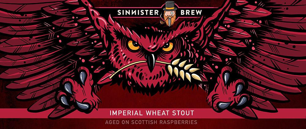
Sinnister Brew is a Pico-brewery producing premium quality, barrel-aged imperial stouts in Dalkeith, Midlothian. I’ve recently worked with the company to produce design and illutration for their bottled and canned beers. The following examples show final designs and illustration work produced using Procreate on an iPad.


Description: Digital illustration | Double Trouble Stout


Description: Digital illustration | Weizen Up Stout


Description: Digital illustration | Seven Seas Imperial Stout


Description: Digital illustration | Enenra Stout


Description: Digital illustration | Biomech Bee

Fly Fishing Illustration


Description: Digital illustration | Baitfish

During the Covid pandemic lockdowns, I took the opportunity to learn some new skills and produced a series of illustrations using an iPad and Procreate software.


Description: Digital illustration | Jock Scott Salmon Fly

Description: Digital illustration | Bloodworm

Description: Digital illustration | Bead Head Blue Flash Damsel

Description: Digital illustration | Choronomid/buzzer pupae

MFT Appraisal Toolkit


Client: Manchester University NHS Foundation Trust
Description: Interactive PDF

Manchester University NHS Foundation Trust required an interactive appraisal toolkit which would enable staff to complete prior to appraisal meetings and also include guidelines and checklists for managers and staff. The design and interactive elements were produced in Adobe InDesign with form elements added in Adobe Acrobat. Two versions of the form element was made available as a stand alone document for staff to complete electronically or print out and complete manually.

MFT Staff Survey Results


Client: Manchester University NHS Foundation Trust
Description: Powerpoint Slides

Development of a graphic style within the constraints of the corporate identity guidelines to illustrate the Trust’s staff survey results. The graphic device conveys a mark out of 10, a comparison with the previous year, a comparision with national results and a traffic light system to illustrate whether the result exceeds, is the same as or compares less favourably to the comparator.

Euro 2012 Magazine


Client: Express Newspapers
Description: Retail Magazine

This 64 page magazine was produced on behalf of Express Newspapers as a guide to the Euro 2012 soccer championships. It covered all the teams, fixtures, star players, facts and qualifying statisitics. Once the copy had been received from the writer, appropriate pictures were chosen from the sports stock library and the layouts assembled. An A2 wallchart showing all the fixtures, the stadia and the route to the final was also produced for inclusion in the magazine.

A similar magazine was also produced for the same client for the 2010 World Cup.

UHSM News


Client: University Hospital of South Manchester
Description: Newsletter


Cover and spread for UHSM News – newsletter for the University Hospital of South Manchester staff. Working in liaison with the communications team, supplied copy and pictures compiled into a 12 page layout. Reprographic work including image manipulation and optimisation culminated in the production of high resolution, print ready artwork.

Linocuts

Description: Illustration

Two original linocut prints. The first was subsequently scanned, made into a silkscreen and printed onto t shirts. The second design was for a home brewed beer label. Wee Stooshie was the name chosen for the character that embodied a particularly punchy double IPA. It’s also a Scottish phrase for a ‘little bit of bother’.

T Shirt Graphics

Description: T Shirt Designs

An interest in creating artwork not entirely reliant on digital design led to the founding of a hobby business – ‘Chuck’s Original Tees’. Inspiration came from hobbies and interests and the resulting designs were hand screen printed onto t shirts. Most of the images were composed off screen and then made digital to produce acetates. These were then exposed onto hand built silk screens and finally used to print onto t shirts. All great fun, though printing designs with four colours were quite a challenge on the kitchen table!

Browtons T Shirt Design


Client: Browtons Bar & Bottle Shop
Description: T Shirt Design

A particularly ambitious three colour t shirt design for a friend that owns a bar/bottle shop. As a tattoo aficionado, the design reflects the owners personal stlye, with references that allude to the bar’s northern location (the flat cap) and the crossed bottle openers completing the twist on the traditional skull and crossbones design.

Broadbottom Village Tube Map


Client: Broadbutties of Broadbottom
Description: Graphic Design

The owners of Broadbutties sandwich bar originally wanted a piece of wall art that was colourful, engaging and reflected their location. A book of walks around the village became the reference for a tube map style graphic that was reproduced one metre square. The design was later transformed into an A6 postcard and an A3 print.